 This is a weekly meme hosted by the amazing girls at The Broke and the Bookish.
Who said don't judge a book by it cover? Obviously they have never been into a book store. With all of the options, appearance is going to a factor.
This week's list is our top ten best and worst book cover trends.
Max
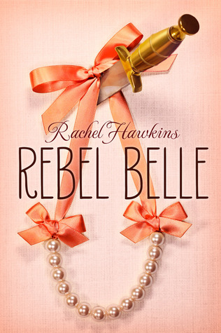
COOL TREND: That really cool font and fonts like it like the one on Rebel Belle by Rachel Hawkins
ANNOYING TREND: When book covers just features a girl and what she's wearing but don't even show her face, like Everneath by Brodi Ashton.
COOL TREND: That really cool font and fonts like it like the one on Rebel Belle by Rachel Hawkins
ANNOYING TREND: When book covers just features a girl and what she's wearing but don't even show her face, like Everneath by Brodi Ashton.
COOL TREND: Doodled/Cartoony cover pictures like Eleanor and Park by Rainbow Rowell.
Tessa
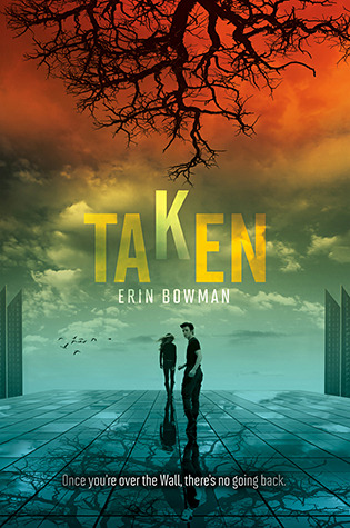
ANNOYING TREND: Things that never really happened in the book/misleading covers designed just to attract readers, like Taken by Erin Bowman.
COOL TREND: Simplistic, but elegant covers, like Angelfall by Susan Ee.


COOL TREND: Simplistic, but elegant covers, like Angelfall by Susan Ee.

Cassia
ANNOYING TREND: Close-ups of models meant to represent the protagonist and absolutely nothing else, like North of Beautiful by Justina Chen.
ANNOYING TREND: In romance novels: unidentified, faceless male, like Hush, Hush by Becca Fitzpatrick. By the way, I love all the covers in this series, but it is an example of the trend.
ANNOYING TREND: Hidden face, face in concealed in shadows. I haven't actually read this book, Frostbite by Richelle Mead, but I was looking for a good example.


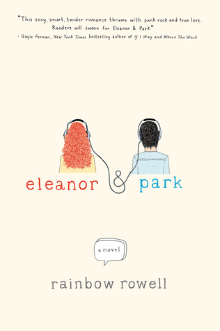


I love the cover of E&P it's one of my favorites!
ReplyDeleteI don't know if I'd call the guy on the cover of Hush, Hush "unidentified". If you read the book, it's pretty clear who/what he is!
ReplyDeleteCovers that have things that didn't happen in the book are kind of annoying. So are covers with people who look nothing like the characters they're supposed to represent!
Covers with models that look nothing like the actual characters is one of my biggest pet peeves!
DeleteYeah, I see what you mean (and I agree) but it was the best example I could find. Sorry about that. ;) Here, I found one. I only read a little bit of the summary, and for this cover it's more of a "cool" trend, but it gets the idea across: the cover of DARK MIRROR by M. J. Putney. Sorry about the bad example.
DeleteI don't like half faces or no heads either
ReplyDeleteExactly! As annoying as it is, though, I think it's part of what draws you in to read the book. It sure does for me. Even though I hate to admit it. ;)
DeleteFirst of all, I have to say I love your blog name! I am too!! Second, I followed you on Pinterest! Third, I agree with this whole post. You are right on! I mega loathe the covers with kissing couples or half naked couples. Just wrong and annoying!
ReplyDelete- Elizabeth @ Book YAbber.
Thanks! Those kind of covers are super annoying, and I feel like if I want to read that kind of book in public I have to cover the cover lol.
DeleteWOW you're so good at this.
ReplyDelete